Café Vulpine is an imagined artisan coffee brand, inspired by the quiet charm and intelligence of the fox.
The project explores the intersection between warmth, minimalism, and playful sophistication creating a cohesive visual world that feels handcrafted yet modern.
Overview
The name “Vulpine” (meaning “fox-like”) evokes curiosity and character.
The brand identity revolves around the symbolism of the fox, clever, graceful, and quietly confident, translated into a cozy café atmosphere that celebrates thoughtful design and slow moments.
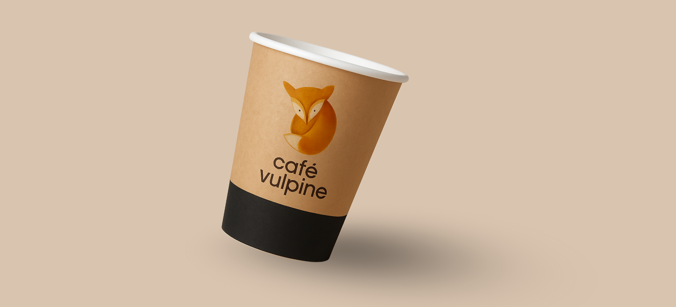
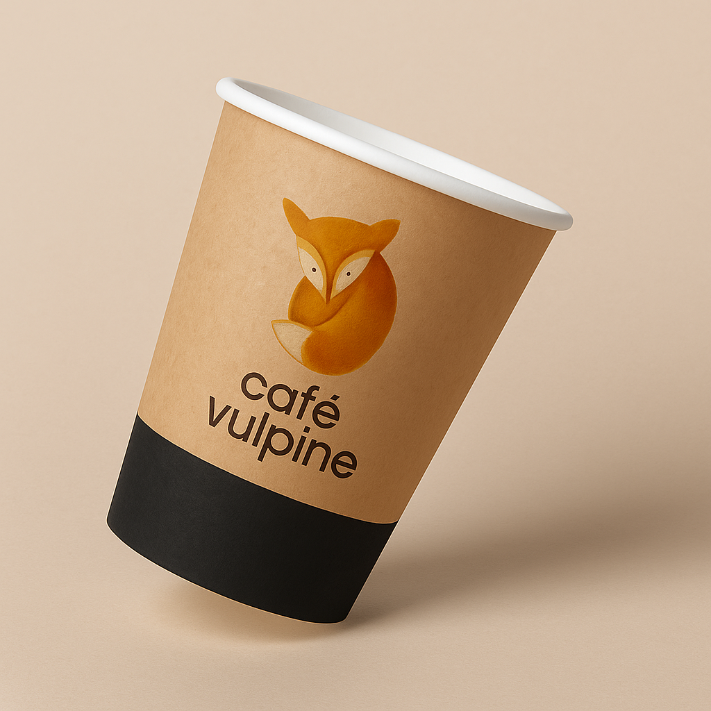
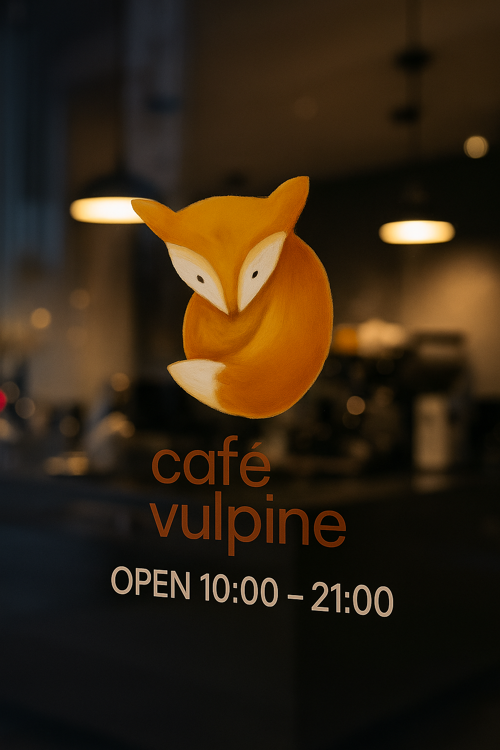
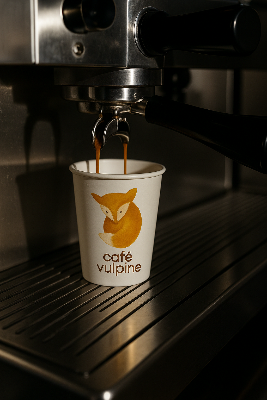
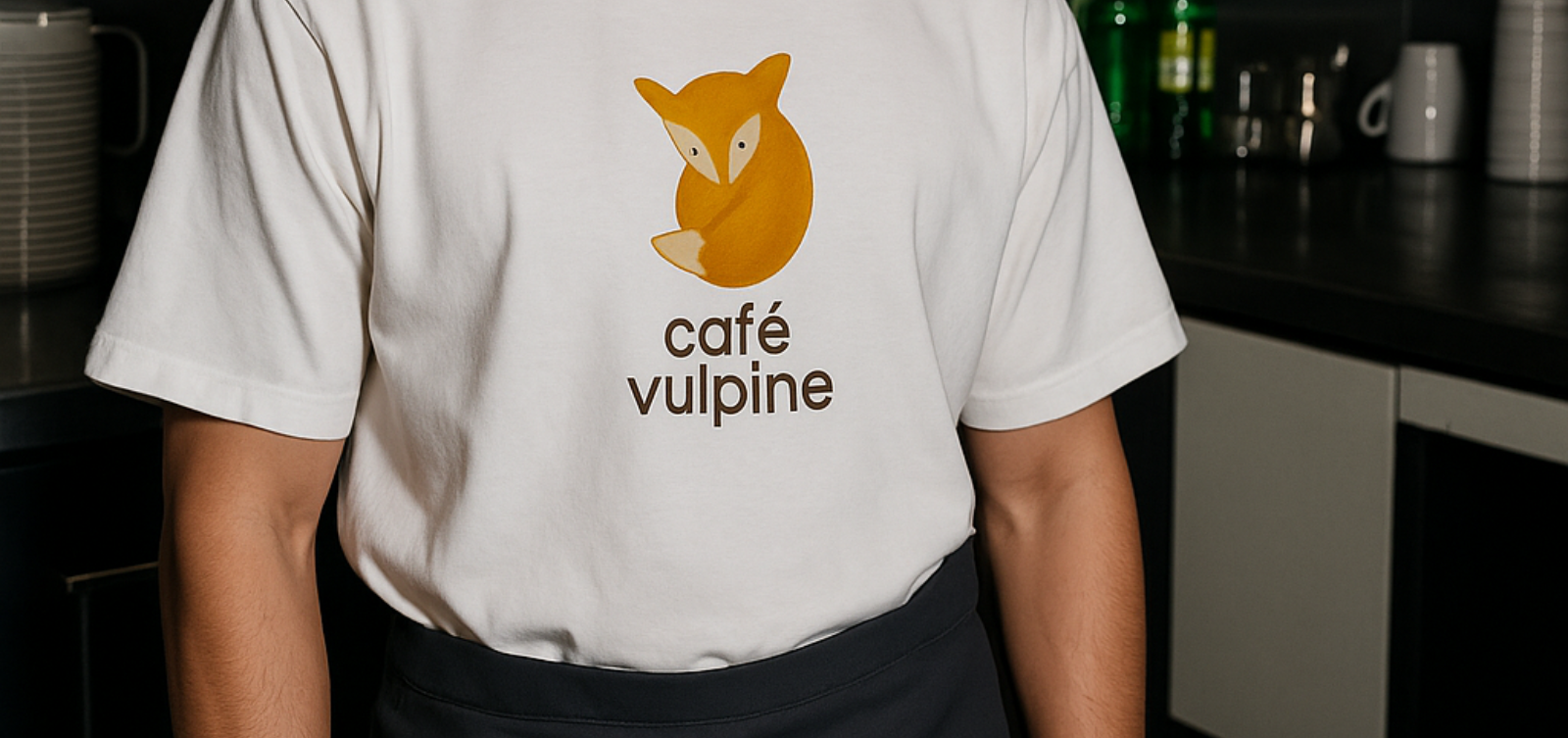
Logo & Illustration
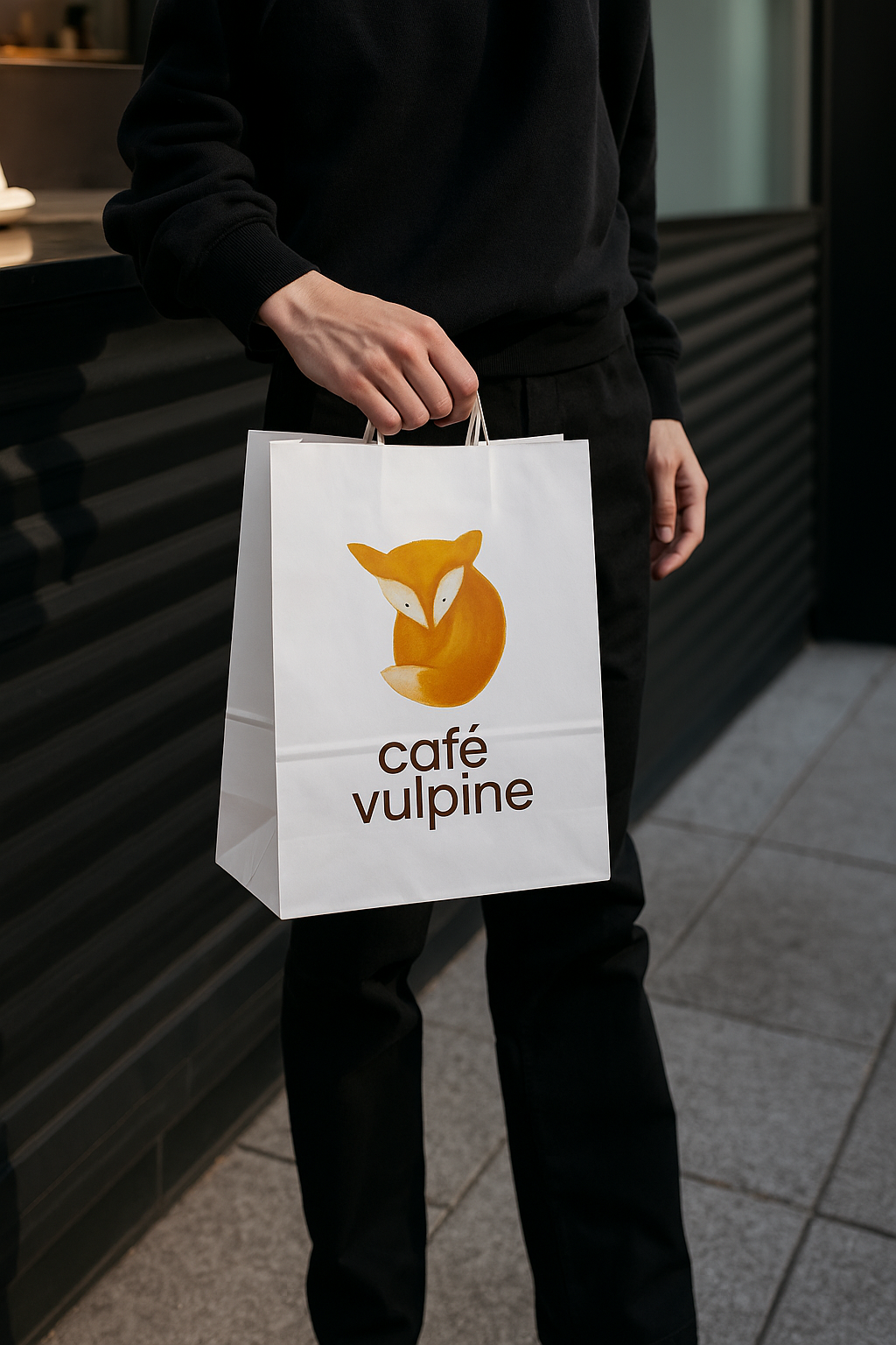
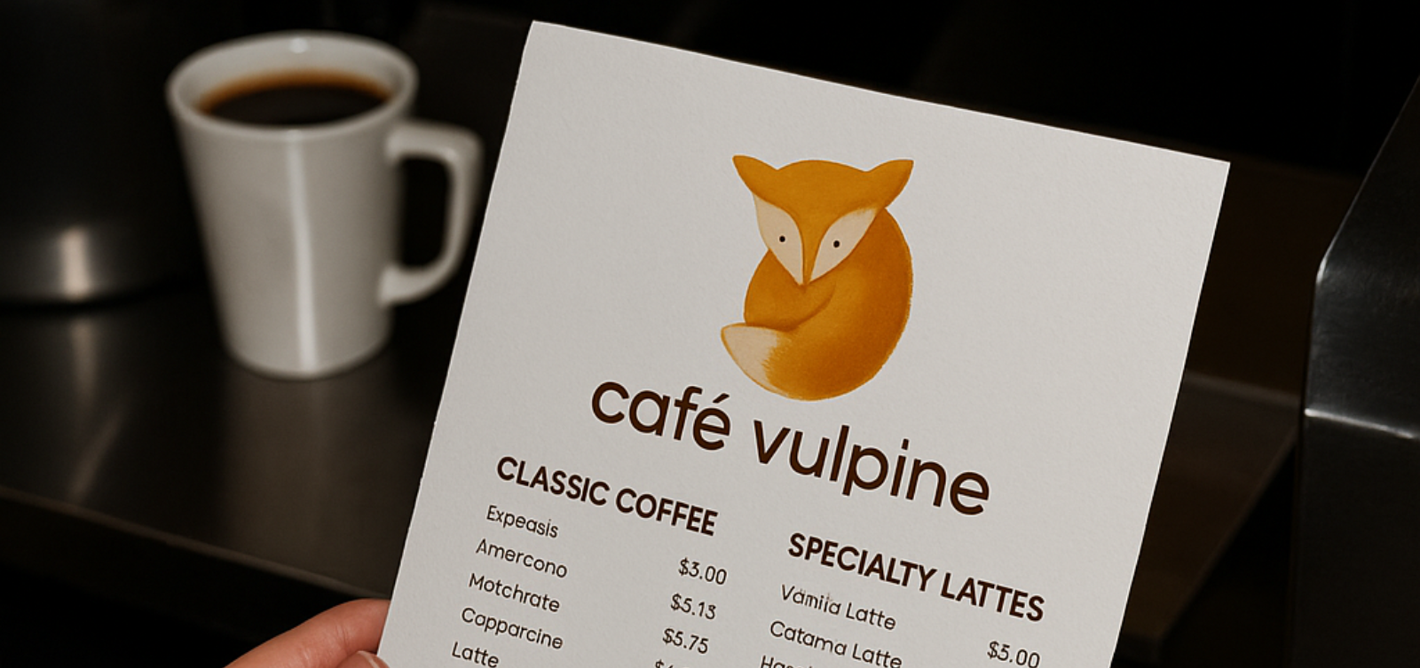
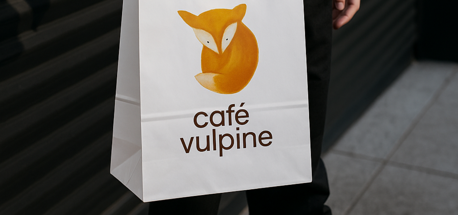
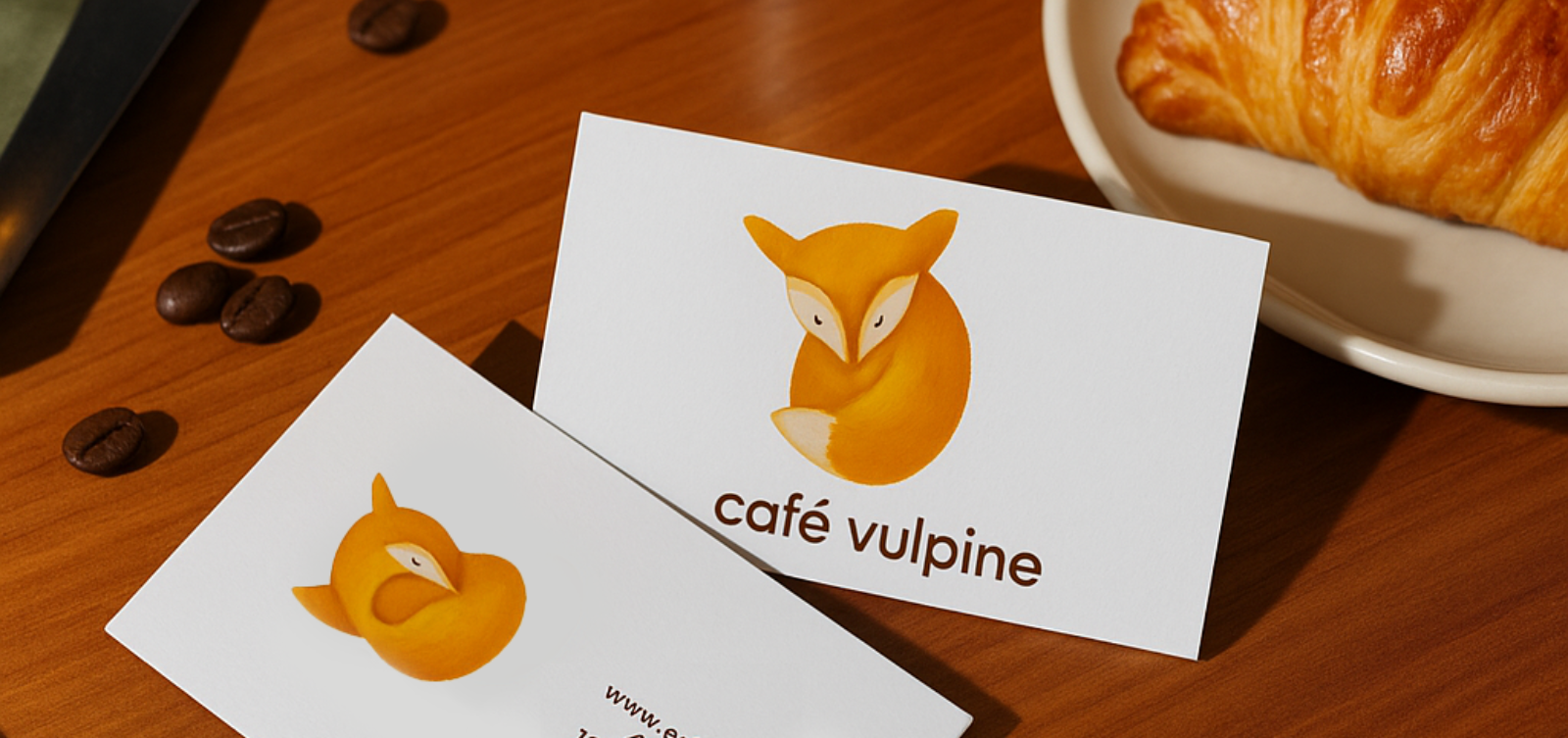
The hand-painted fox illustration anchors the visual identity.
Its soft brushwork and curled shape suggest warmth, rest, and comfort; mirroring the café experience. Paired with a clean geometric typeface, the contrast between organic form and structured typography creates balance and refinement.
Color Palette & Typography
A restrained palette of warm amber, kraft beige, and deep espresso brown brings tactile, natural warmth.
Typography stays modern and human, rounded sans-serifs that echo the logo’s approachable feel while maintaining clarity across print and digital applications.
Applications
The brand extends across various touchpoints, reflecting a cohesive visual rhythm.
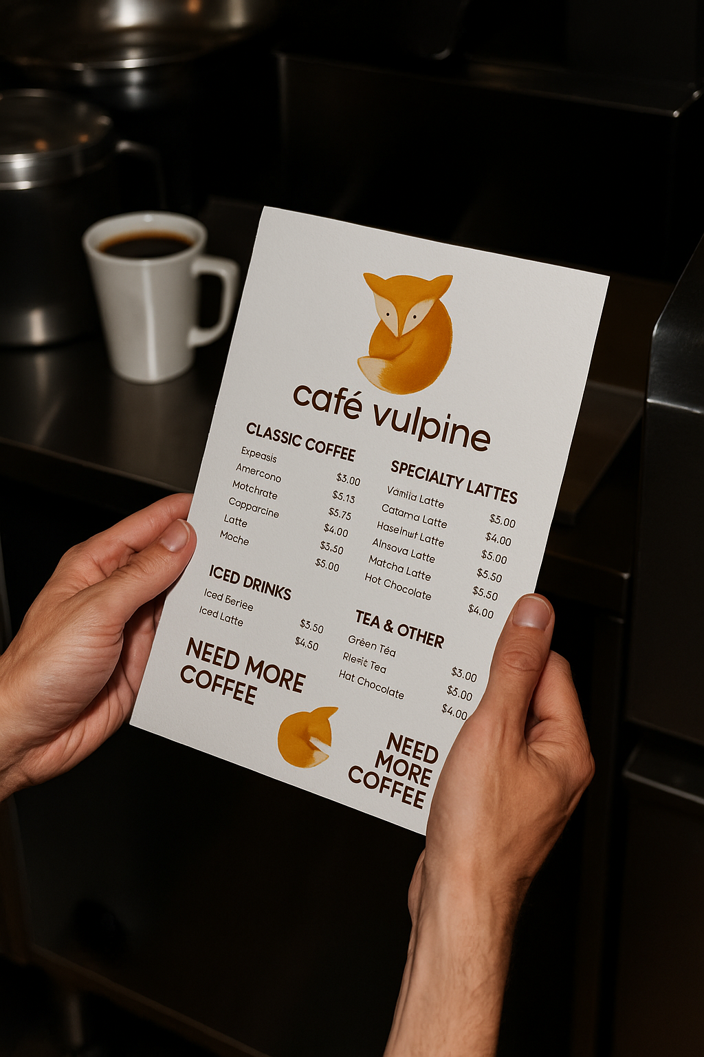
Menu design – tactile minimalism, printed on soft off-white stock.
Coffee cups & packaging – kraft paper textures and clean layouts highlight the fox mark.
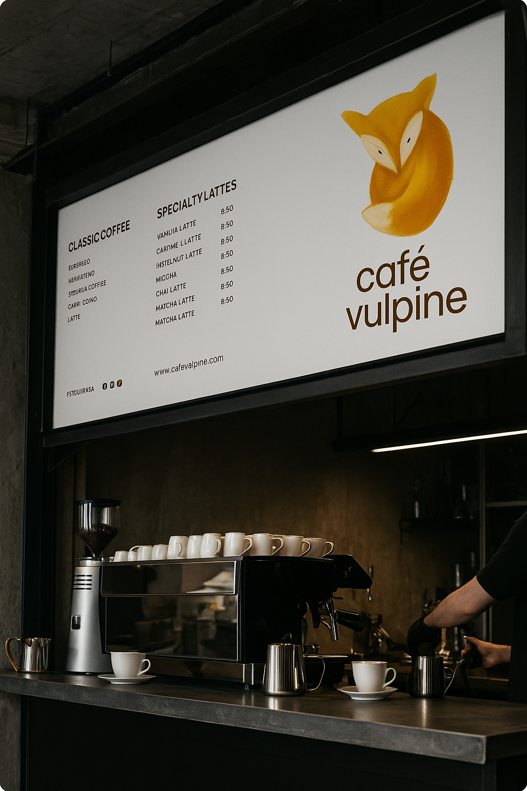
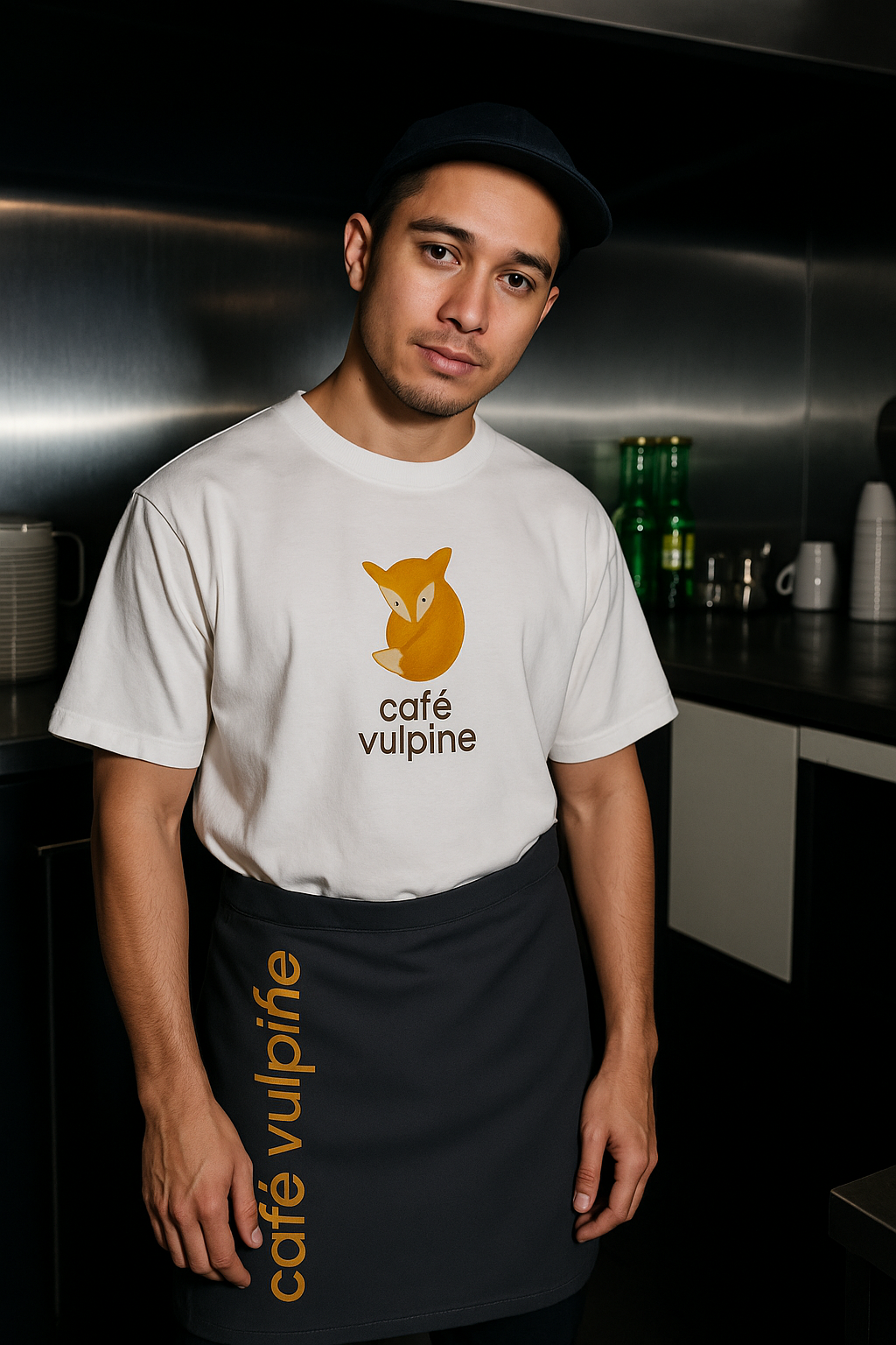
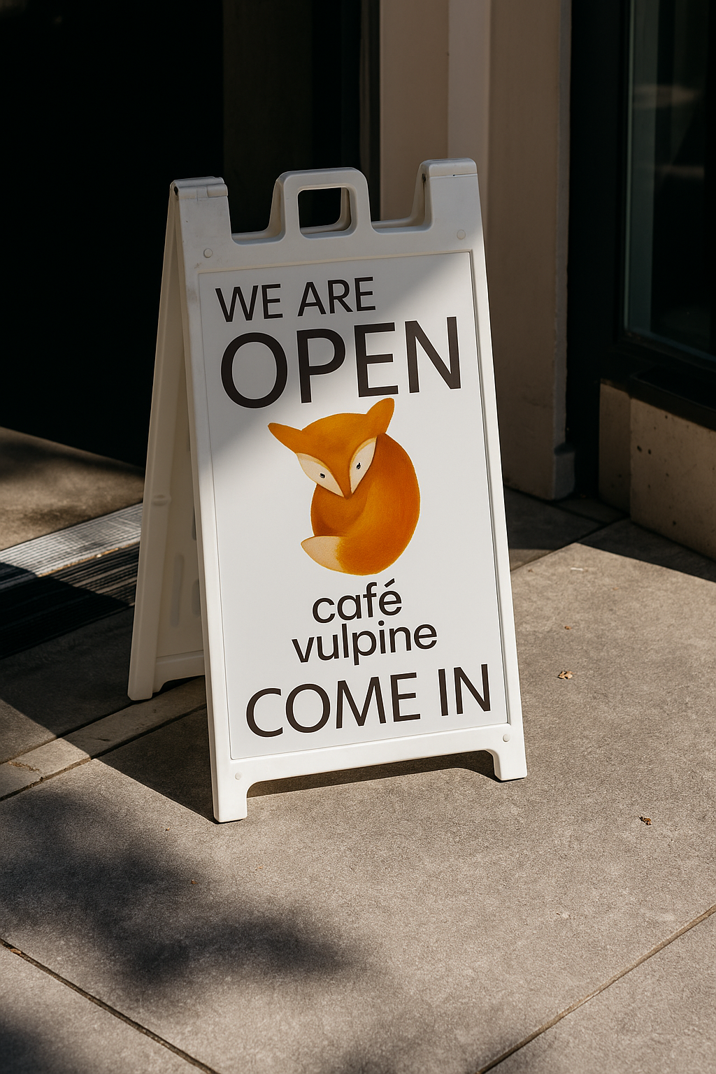
Uniforms & signage – understated branding balanced by a strong logo presence.
Business cards & takeaway bags – compact brand ambassadors that embody the café’s approachable charm.